Here’s a comparison of the fonts used by the biggest tech companies, apps, and social media platforms…
What font does Google use? What about Facebook or Twitter? Font choice is important because it is directly related to user experience. And plenty of tech companies – like Apple, for instance – take their font choice very seriously.
Steve Jobs was notorious for his opinions on certain fonts, for instance, because he knew all too well the effect they had on users inside the Apple ecosystem.
But when it comes to font choice inside popular apps like Twitter and Instagram, what do these huge social networks use? And, more importantly, why do they use these particular fonts?
In this guide, we’ll compare and contrast all the main fonts used by the world’s biggest tech companies, apps, and social media platforms like Reddit, TikTok, LinkedIn, and Discord, and then look at why they choose them.
The Fonts Used By World’s Biggest Tech Companies
| Tech Brand / Company | Font Used |
|---|---|
| Apple | San Francisco (SF) |
| Helvetica or Arial | |
| Helvetica Neue | |
| Neue Helvetica | |
| Spotify | Proxima Nova |
| Roboto | |
| Android | Roboto |
| Discord | Uni Sans |
| TikTok | Sans Serif |
| Noto Sans | |
| YouTube | Roboto |
| Amazon | Amazon Ember |
| Netflix | Graphique |
| Wikipedia | Arial |
| Helvetica / Arial |
Why Font Choice is Important
Font choice – also known as typography – is a very important aspect of design. Choosing the wrong font for your web platform can make it harder for users to engage and/or consume content. This is why most tech companies, large and small, tend to use Sans Serif-based fonts. These types of fonts are easy on the eye and make reading less effort as the letters are simply designed.

Sans Serif is French for “without stroke” – it dates back to when fonts were designed by hand. Essentially, Sans Serif-based fonts – Arial, Helvetica, Geneva, Product Sans, etc – do not have a finishing stroke at the end. These design tweaks make them appear “less busy” which in turn makes them easier on the eye when compared to Script-based fonts and Serif-based fonts like Times New Roman, Georgia, Garamond, and Century.
While serif fonts focus heavily on embracing tradition and history, sans serif fonts take the opposite approach and embrace simplicity and the feeling of being modern. The main characteristics of serif fonts are their lack of serifs and use of simple, clean lines that are the same width throughout.
The clean, crisp lines of sans serif fonts are the main reason many web designers prefer this style of font for on-screen use. The clean lines and sharp edges are able to render out more clearly on a screen which increases legibility for users.
IMPACT PLUS
How Fonts Are Used For Branding
Typically, sans serifs fonts like Helvetica, Open Sans, Proxima Nova, and Arial are considered to be more youthful, cool, and modern. This is why these types of fonts are popular with tech companies and start-ups that are looking to develop a youthful brand to appeal to potential users.
Again, these types of fonts also come across as more casual than standard serif fonts. This, again, is a big deal for tech companies and social media platforms. In order for people to consume and/or spend as much time as possible inside a certain website or app, the user needs to feel comfortable. And the choice of font used by the application or site’s owner is a key factor in making this happen, whether you – as the end-user – are aware of it or not.
Why Steve Jobs is The Godfather of Modern Fonts
I mentioned Steve Jobs in the intro to this post. The reason for that is that Jobs was fascinated by fonts and typography. It was Jobs, for instance, that insisted the first Apple computers use a “beautiful, human” font that was both nice to look at but also relatable. Jobs even took a calligraphy class during his time at Reed University.
During his time at Reed, Jobs was instructed by Robert Palladino. Following Jobs’ death, Palladino commented on Jobs’ role in popularising fonts with the public and how he made them a “design talking point” through his insistence that early Apple computers should come with a range of beautiful font options.
In the same way that the printing press drove the rise of literacy in the late Renaissance, I think Steve Jobs has driven the rise of design as something that the general public is before fontaware of. He drove an awareness of design including typography in particular.
Robert Palladino
Palladino wasn’t alone in his praise of Jobs either. Thomas Phinney, a senior product manager for fonts and typography with Extensis, says Jobs earned this nickname as the godfather of modern fonts by popularising the concept to such an extent that “normal people” walking around had firm and fast ideas about what their favorite fonts were. Prior to Jobs, this just wasn’t a thing.
I remember, painfully well, the early days of computers when we had monospace fonts on screen, before WYSIWYG and all that. What Jobs did with the Macintosh was not just revolutionize digital typography—that would have happened sooner or later. The unique thing he brought to it was the democratization of digital type.
Thomas Phinney
What Font Does iPhone Use?
Jobs’ influence on font choice can be felt in all of Apple’s older and current products from its first-generation Mac computers right up to the iPhone and iPad. As of 2022, the standard font used on iPhones and iPad is called San Francisco (SF), although Apple also uses variations of this font like SF Compact, SF Mono, and SF Arabic.

Apple’s SF font was designed by Apple for use inside iOS and its other platforms like macOS and watchOS. Apple also has a complementary font called New York that it also supports and uses inside iOS and macOS, though SF is its most well-known and most used font on its most popular products like iPhone and Apple Watch.
San Francisco is a sans serif type family that includes SF Pro, SF Pro Rounded, SF Mono, SF Compact, and SF Compact Rounded. SF Pro is the system font in iOS, macOS, and tvOS; SF Compact is the system font in watchOS. Designed to match the visual clarity of the platform UIs, the system fonts are legible and neutral.
Beginning in iOS 14, the system provides the San Francisco and New York fonts in the variable font format. This format combines different font styles together in one file, and supports interpolation between styles to create intermediate ones. With interpolation, typefaces can adapt to all sizes while appearing specifically designed for each size.
Apple
Apple’s San Francisco Font
Apple’s developers can use SF and New York, as well as all of their myriad variations, sizing options, and type settings inside applications and widgets for iPhone. Apple deliberately designed its SF and New York fonts to look modern, extremely legible, and to create a feeling of familiarity and comfort. Apple’s San Francisco font was initially launched in 2014. It was heavily influenced by Helvetica and DIN. macOS’ Galvji font is similar to the San Francisco variant SF Pro Text but it has lower leading and bigger spacing.
Google Roboto Font
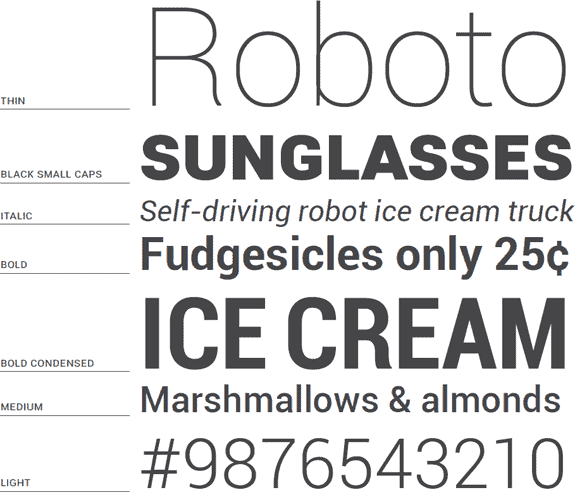
Never one to be left out, Google also takes its choice of font very seriously. And that’s probably a good thing too – billions of people use Google services every day. Since 2011, Google’s font of choice has been Roboto which was developed in-house by Google and is, if you want to get all technical about things, a neo-grotesque sans-serif typeface.
On Android, the Noto font is used for languages that are not supported by Roboto. These include Chinese (simplified and traditional), Japanese, Korean, Thai, and Hindi. The reason Roboto is not supported by these languages is that they’re predominantly logosyllabic. There is NO alphabet in the modern Chinese language, for instance.
Roboto has a dual nature. It has a mechanical skeleton and the forms are largely geometric. At the same time, the font features friendly and open curves. While some grotesks distort their letterforms to force a rigid rhythm, Roboto doesn’t compromise, allowing letters to be settled into their natural width. This makes for a more natural reading rhythm more commonly found in humanist and serif types.
Google

You will find Google’s Roboto font used inside Google Play, YouTube, Google Maps, and Google Images. Google has changed the look and feel of its Roboto font a couple of times too. The most significant of which was inside Android Lollipop during 2014, where Google made Roboto simpler and smarter-looking, taking influence from other popular san serif fonts like Trebuchet MS.
Plenty of apps – like Instagram, for instance – allow you to change the default fonts as well, so you can customize your posts and/or content. Here’s how to change Instagram’s default font, for instance – just note it does require third-party software.


