Landing pages aren’t complex. But there are some rules and best practices you need to be aware of if you want them to actually convert.
Keep All The Important Stuff Above The Fold

The “fold” is the bottom of the screen before a user has to scroll.
Everything a visitor sees in this initial view, often called the Hero Section, is critical.
Your goal isn’t to prevent scrolling, but to make the value so clear that they want to either convert immediately or scroll to learn more.
Focus on getting these elements right, especially for mobile devices:
- An Attention-Grabbing Headline: Clearly state the problem you solve or the outcome you provide.
- Compelling Body Copy: A short, powerful sentence or two that expands on the headline.
- A Clear Call to Action (CTA): The button or form to take the desired action.
Design with a mobile-first approach. Most of your traffic will come from phones, so build the page with this in mind.
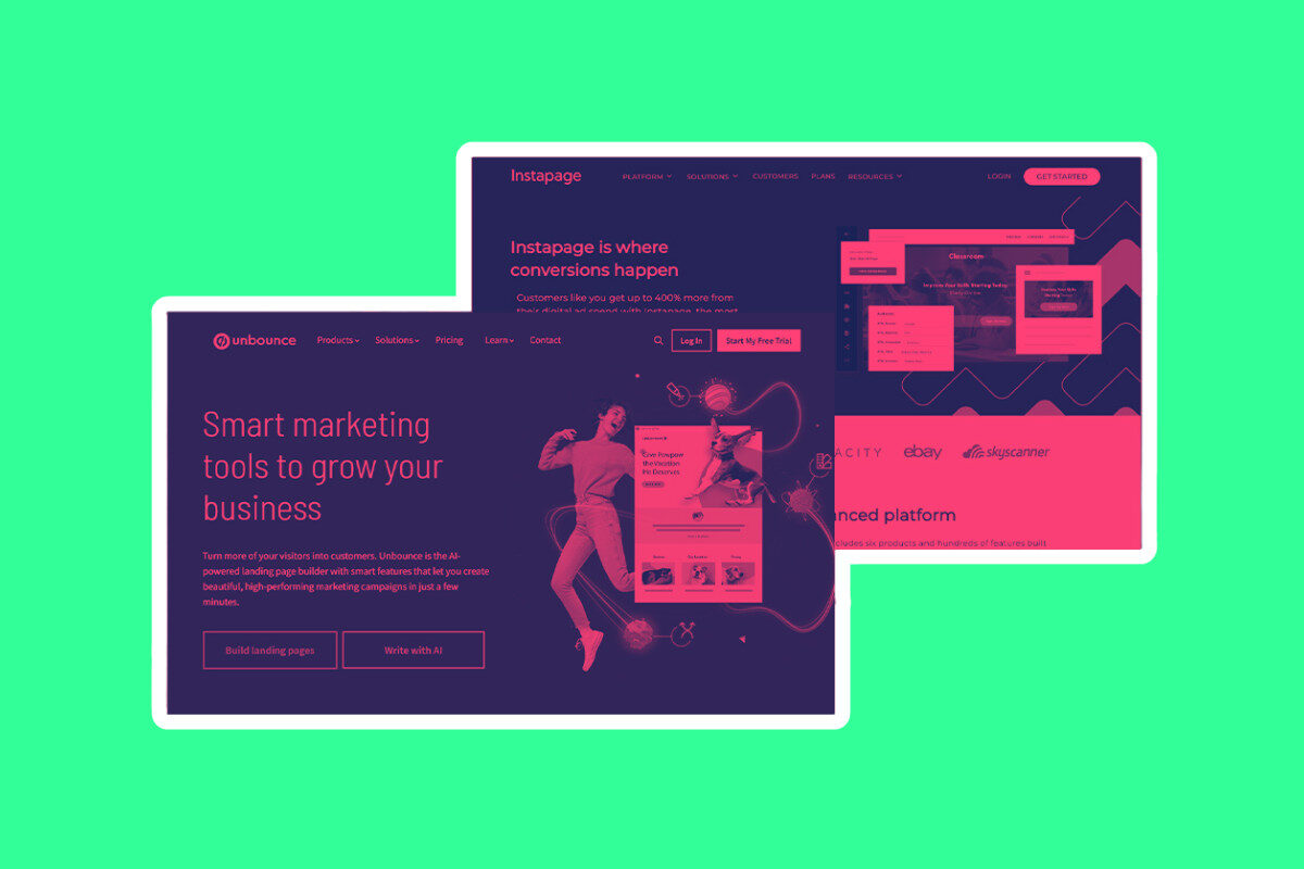
I use Unbounce for all my landing pages; it’s the most affordable of the premium landing page builders and it lets you edit in mobile view.
If your page looks great on a small screen, it will be easy to adapt for a stunning desktop experience.
Eliminate All Distractions
Second, keep distractions to an absolute minimum.
An effective landing page typically only includes:
- A single, clear Call to Action (CTA)
- A powerful headline and sub-headline
- Concise, benefit-driven copy
- A relevant image or short video
All the best landing pages always follow this formula.
Simple is good.
A landing page lives to serve one purpose: to make the reader take action.
You don’t want myriad options, flashing banners, walls of text, and lots of images and videos.
Less is more. Let your copy do the talking, not your design skills.
And remember: distractions kill conversions.
Getting Busy Below The Fold (Hero Section)
In an ideal world, a person lands on your page, sees the offer, and hits the CTA.
Boom, you got your conversion.
Annoyingly, this isn’t how things work. The vast majority of visitors to your landing pages will require a little more convincing.
The space below the fold is your second chance to win them over.
Use this section to build trust and overcome skepticism:
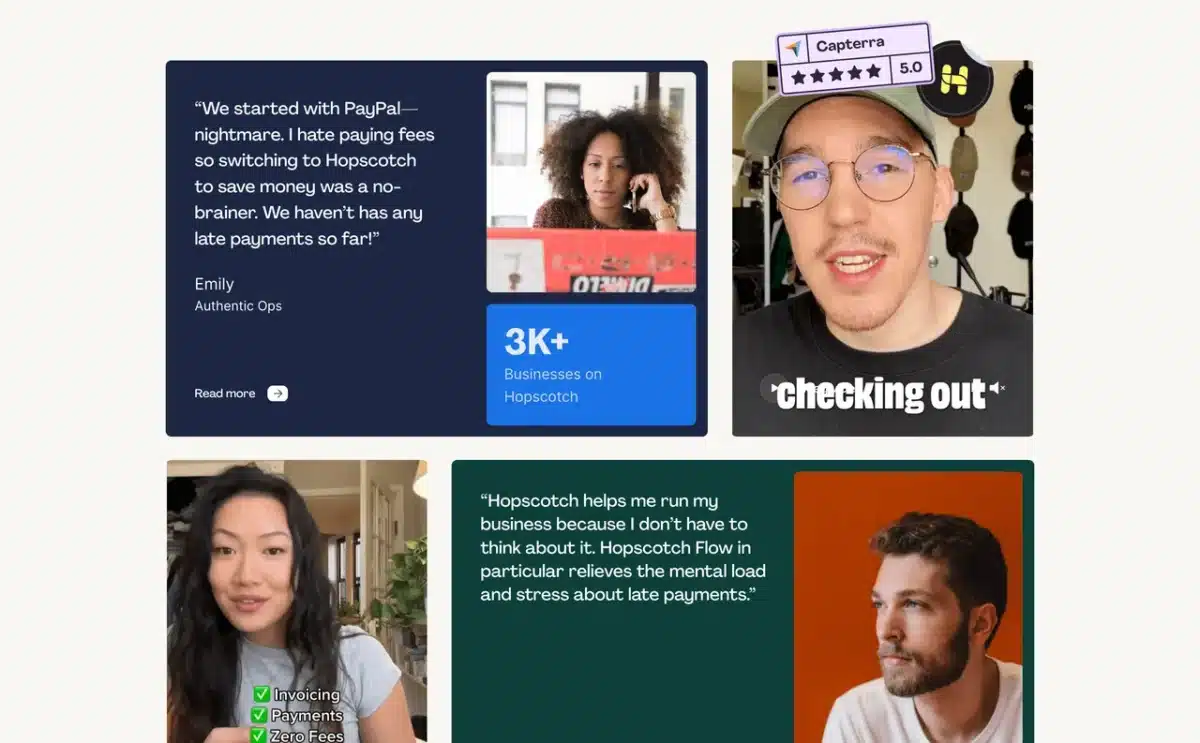
- Social Proof: Include testimonials, reviews, or logos of companies you’ve worked with. I like Senja for this; it’s WAY cheaper than TrustPilot and simple to use.
- Key Benefits & Features: Use bullet points and punchy headlines to explain in more detail what you’re offering and how it helps the user. Really drill-down on the unique benefits here, exclusivity and scarcity moves the needle.
- Address Objections: Think about what might stop someone from converting and answer that question proactively.
Keep your copy tight and use visuals to break up the text.
No one wants to read a wall of text.
All Good Landing Pages NEED A Rock-Solid Offer. Duh!
If your offer sucks, your page will not convert. This is why most landing pages are spectacular failures.
You need to think about context and who you’re targeting.
Be specific too.
Each landing page you create should have a specific goal and user in mind.
Next, you need to think of how you’re going to frame your offer or call to action.
The best landing pages either solve a problem or give the reader something they want for less.
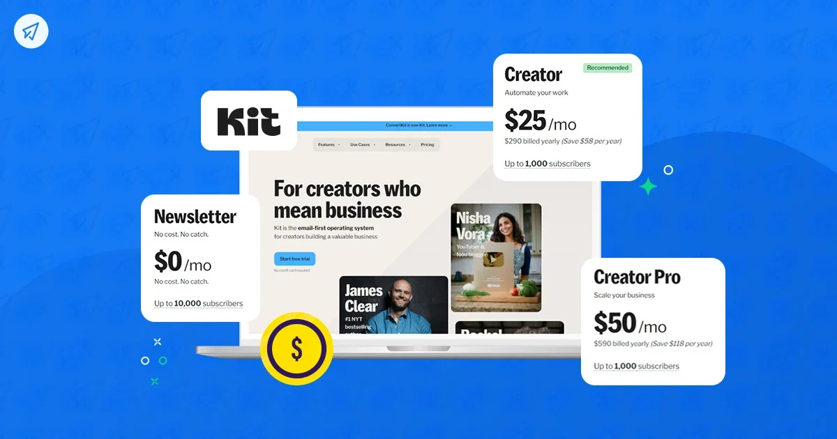
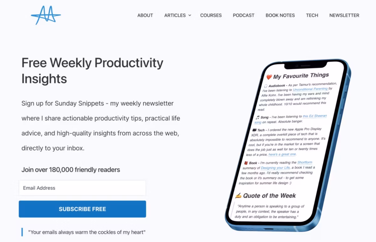
Landing pages for newsletters and general email lists are trickier because you’re selling the long-term value of being part of your list.
Get Really, Really Good At Building Lead Magnet
This is where lead magnets come into play.
You develop something you know your audience wants (read more about how to develop lead magnets here) and then you give it away in exchange for their email.
Lead magnets are simple to create but you need to 1) know your audience inside out and 2) understand their problems in order to create a compelling one that converts.
“Subscribe to my newsletter for updates” does not cut it. Neither does, “join our mailing list for our latest posts”.
You need to offer tangible value upfront.
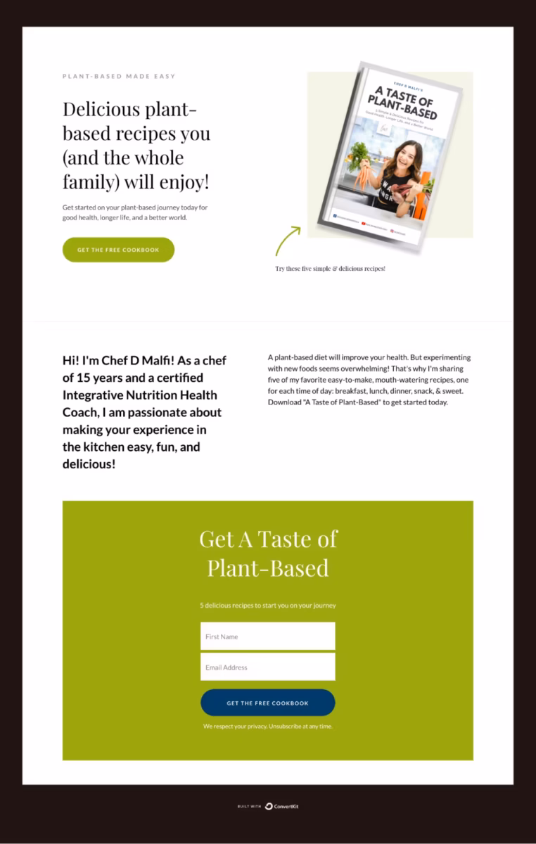
A great lead magnet does all of the following:
- It’s highly specific: It solves one particular problem for your ideal subscriber.
- It delivers a quick win: It should be something they can consume and get value from immediately (e.g., a checklist, a short video tutorial, a template).
- It demonstrates your expertise: It gives them a taste of the value you’ll provide in the long term.
The Most Important Thing: Be Authentic!
Your lead magnet is often your first real interaction with a new member of your community.
First impressions are everything.
Take the time to create something genuinely helpful.
This is where so many creators slip up; they think they can get away with mugging-off their audience with AI generated slop.
You can’t; it reeks of laziness, and they’ll smell it.
Lead magnets don’t have to be fancy but they do need to deliver on their promise.
I’ve lost count of the amount of low-effort, low-value lead magnets I’ve received over the years.
Don’t be that guy (or gal).
Take your time making your lead magnet, put a lot of effort into it. First impressions count when you’re building-out a thriving community.
OK, that’s my basic guide on how to create a decent landing page for growing your mailing list.
Here’s some wider reading and some additional nuggets advice from some of the writers and thinkers I follow, trust, and respect.
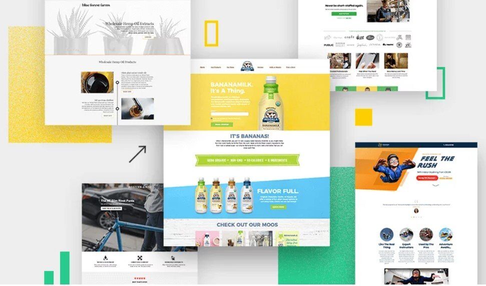
Landing Page Examples, Tricks & Quick Fixes

Here’s some handy tips on what NOT to include in your landing page designs via CXL.
- Navigation menu—focus only on your offer;
- Links to other parts of your site, such as “About Us”;
- Pictures or images that don’t relate to the offer; these are distractions;
- Hard-to-read text (i.e. anything less than 12px);
- Scary forms with unnecessary fields, such as “title” or “fax”;
- “Clear fields” button;
- Links like “Click here to subscribe” or “Click here to read more.” If you can’t cram all your content above the fold, let the user scroll down. Scrolling is almost always better than clicking to another page.
HubSpot has made billions helping B2B and B2C businesses grow their audience and reach.
In this quick tip, Hannah Harris outlines her approach to getting into the right mindset when sitting down to write copy for a landing page:
If I’m building a landing page for a B2B product, I might lean into ROI, pain points, and use cases. For a B2C offer, tone and emotional pull might matter more. Either way, I want the message to feel like it was written just for them.
All landing pages are about one thing: getting the person to act on the CTA.
BrightEdge has a detailed guide on its approah to designing landing pages but I really like this section on always ensuring your CTA is MASSIVE so the reader cannot miss it.
The most successful landing page CTAs are unmissable. The color palette of a landing page can affect user interaction based on emotional and gender factors. But a likelier influence on user behavior than color scheme is “pop.” CTAs need to be isolated on the page with either white space or color. Readability is also crucial. “A CTA is ideally white text on a dark background—it converts more than dark text on a light background,” Sweeny says. “Anything is better than dark-on-dark—no one wants to go there.”
Once you’ve got the basics of building and deploying landing pages down, you can begin experimenting with things and A/B testing your pages to see how they compare.
One of the easiest potentially quick-win experiments you can try, according to Bulldog Digital Media, is multi-step forms:
Using a multi-step form can do great things to your conversion rates. You can use a 2 step form to ask qualifying questions (a question that can confirm a perfect lead) followed by their contact information. Why does this increase conversion rate, you ask? Often, 2 step forms cause users to think there is less information to fill out. (Remember – people are lazy!)