 Skip to content
News
All the latest mobile phone news about the biggest and best brands – from Samsung phones and iPhone to OPPO, Huawei, OnePlus, RealMe, VIVO, and more. We also cover the latest phone leaks, new releases in the wearables sector, and publish information on the best new phone deals as they happen.

Will iPhone 16 Pro Come With 256GB Of…
Will the iPhone 16 Pro get a storage bump? We explore… It’s been a busy time for iPhone 16 rumors. First, we had the news that some of the iPho...

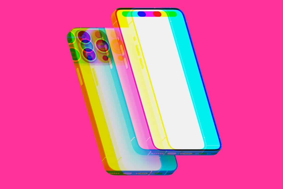
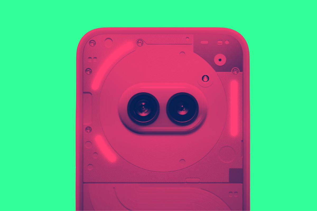
The iPhone 16 Pro May Fix One Annoying…
A new coating may reduce lens flares on the iPhone 16 Pro’s camera. The new iPhone 16 series is still over five months away, but recently more ru...

Android 15 Beta Now Available For These Pixel…
Google has released the highly anticipated Android 15 Beta, giving enthusiasts and developers a chance to experience the latest features and improv...

Apple’s M4 Chip Is Just Months Away
Despite just updating some Macs with the M3, Apple is getting ready to launch the M4. Apple doesn’t appear to be willing to wait when it comes to...

Top 10 Google Product Failures: From Google Glass…
Welcome to Google’s product graveyard, the place where myriad products and ideas now languish. From Google Glass to Stadia and Google Pay, Th...

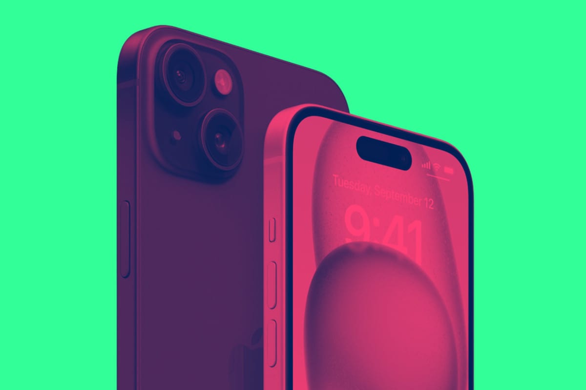
iPhone 16 Colors: Here’s All Seven Rumored Shades
The iPhone 16 Plus is said to come in seven colors. Here’s all of them. As we’re getting closer to Apple’s 2024 Worldwide Developers Conferen...

Google Lost Market Share To Bing In 2024…
Google lost 2% of its search business to Microsoft’s Bing in 2024. Don’t think that’s a lot? It’s equivalent to 180000000 searches… 2% is...

2024 iPad: New iPad Pro & iPad Air…
New 2024 iPad Pros and iPad Airs may finally launch next month. If you’re a fan of Apple tablet computers—the iPad—then you’ll be happy to ...

Apple Robot? The Company Is Working On Them
Apple’s next big thing could be an Apple robot. Here’s what we know. In news we didn’t expect to hear, Apple is reportedly working on its own...

iOS 17.5 Will Let Users Download Apps From…
iOS 17.5 is bringing a major new feature: the ability to install apps from websites. Today Apple released the first beta of iOS 17.5 to developers....

iOS 18 Might Get An Apple Vision Pro-Inspired…
There are lots of iOS 18 rumors out there. But the latest one says it will look like visionOS. iOS 18 is shaping up to be on of the biggest iPhone ...

The Many, Many Problems With Google’s Generative Search…
If ain’t broke, don’t fix it – that’s a good motto to live your life by. Even more so if you own one of the most valuable ...

Arc Web Browser 101: What You Need To…
The Arc Browser is here to upend the entire browser market. It recently snagged Apple’s lead designer for Safari and it is valued at $550 mil...

Gmail Turns 20! Here’s Why Privacy Experts Hate…
Gmail’s been around for two whole decades. But not everyone is a fan of Google’s email platform – here’s why Gmail is simple to use, s...

Google Search is Broken. Maybe For Good – What…
After numerous algorithm updates designed to combat spam and a risky big bet on AI, Google’s best product – search – has never been worse G...

Brave For Mac Performance Metrics & Benchmarks
I recently started using the Brave web browser on my Mac. I noticed it was quite a lot faster, so I did some benchmarks to find out more. Here̵...

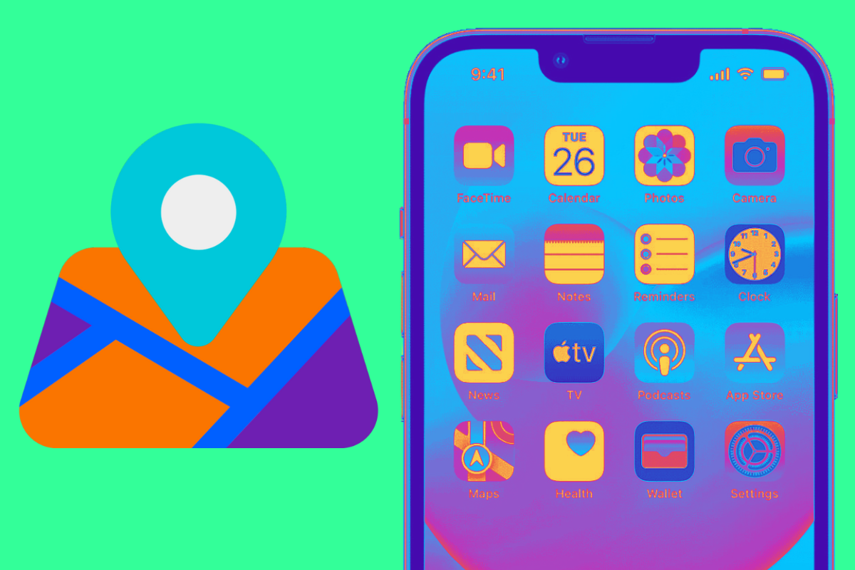
Apple Maps To Get New Features In iOS…
Apple Maps may be gaining new custom routes and topographical maps in iOS 18. iOS 18 has long been rumored to focus on artificial intelligence, but...

Why Must Android Users Pay A Premium For…
Three years’ worth of Android updates on a $500 phone is NOT good enough. On a $800+ phone, it is downright criminal… Android fragmentation has...
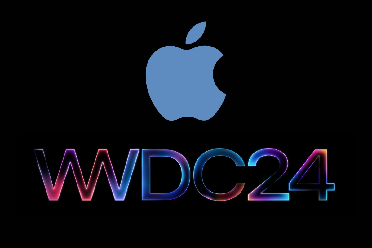
Apple Announces WWDC24: iOS 18 & More Expected
Apple’s annual developer’s conference, WWDC24, is expected to focus on iOS 18 and AI. Apple has officially announced the dates for its next...
The iPhone 13 Pro is Discontinued But I’d…
Apple just killed off the iPhone 11 and the iPhone 13 Pro and iPhone 13 Pro Max, following the launch of the iPhone 14 – here’s why… Hel...

iOS 18 AI May Use Google, OpenAI &…
Apple is reportedly in talks with Google, OpenAI, and Baidu to power iOS 18 AI features. As Apple’s Worldwide Developers Conference approaches in...

iPhone Home Screen To Get Revamp In iOS…
With the release of iOS 18, the iPhone’s homes screen is set to get an update. It has long been rumors that iOS 18 will be one of the biggest upd...

36 Things You Need to Know About Alien:…
The Alien: Romulus trailer has FINALLY dropped. Here’s 36 things you need to know about the film based on what we saw in the trailer and from...

Data Collection & Data Brokers: The Real Price…
It’s all data: the new necessary awareness required when living in the age of data collection and data brokers If we have even a minimal perc...
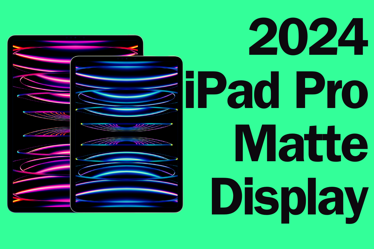
2024 iPad Pro May Gain A Matte Display…
The new display type would mark a significant point in the iPad Pro’s history. It’s not just the upcoming iPhone 16 series that could see displ...
Here’s What Apple’s New “BRS” Design Means For…
Apple’s iPhone 16 to Feature Slimmer Bezels with BRS Technology, Enhancing Display Aesthetics Apple is set to take a significant step forward...

The iPhone 16 Display May Be Larger Than…
Apple reportedly plans to use a new bezel technology to make the iPhone 16 display appear even larger. If you’ve been dreaming of an even larger ...
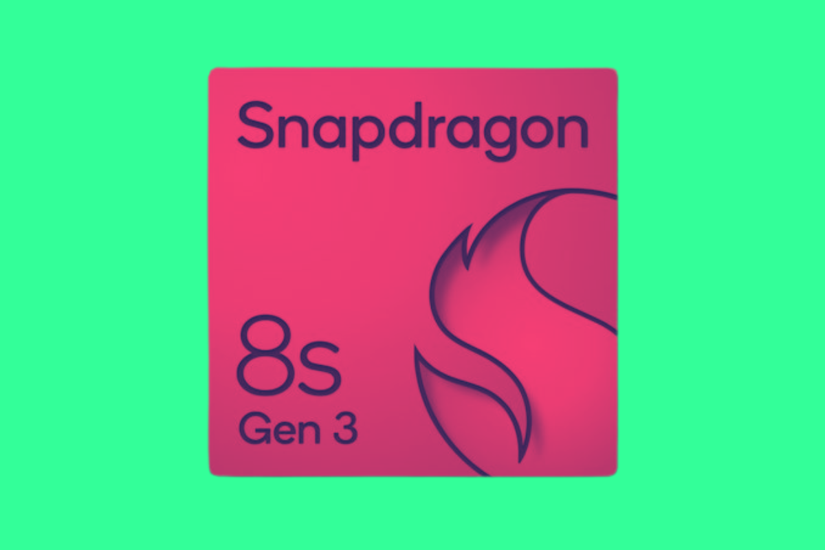
10 Reasons To Get PUMPED For The Snapdragon…
As the cost of flagship smartphones continues to soar, the Snapdragon 8s Gen 3 is being positioned as a more affordable chipset for OEMs that doesn...

Apple Is Set To Release Two New AirPods…
If you’re a fan of AirPods: get ready. Apple is expected to introduce two new models this year. For those hoping for more than a new iPhone t...

The VPN Surge in Texas – What’s Driving…
If you’ve been keeping an eye on the tech news lately, you’ve probably noticed the buzz around the massive spike in VPN usage in Texas....

Walmart Now Sells The M1 MacBook Air For…
This is the first time in the company’s history that Walmart has directly sold a Mac computer. Earlier this month Apple introduced the M3 MacBook...

Nothing Phone 2 Users Are NOT Happy – Here’s…
In the aftermath of one of the most anticipated mobile device launches in recent history, the Nothing community finds itself in a state of unrest. ...

Apple Vision Pro May Soon Launch In These…
Here are the countries that the Apple Vision Pro could come to next… There’s been a lot of Apple Vision Pro news in the past day. Apple’s spa...
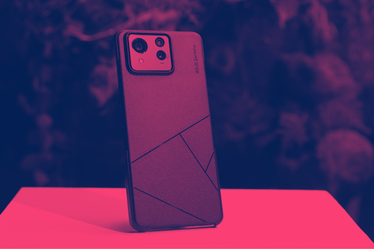
ASUS Zenfone 11 Ultra: Everything You Need To…
The ASUS Zenfone 11 Ultra was officially announced by ASUS on March 14, 2024, during a virtual launch event After much ado and rumors about the pho...
13 Awesome New Features Inside Nothing OS 2.5.3
If you’re picking up the Nothing Phone (2a), it’ll soon be running Nothing OS 2.5.3 – here’s some of its coolest, new features to try… N...

12 Significant Ways TIDAL is Better Than Spotify
Is TIDAL better than Spotify? Let me put it this way: I never thought I’d switch away from Spotify. But after testing TIDAL in late-2023, I c...
Nothing Phone (2a) Hits 100,000+ Sales on Launch…
Carl Pei’s Nothing unveils its new smartphone, the Nothing Phone (2a) – here’s everything you need to know…
...
16 Secret VPN Tricks Every Gamer Should Know…
Think VPNs are just for browsing anonymously and unlocking Netflix? Think again! Here’s 16 unexpected ways a VPN can totally transform your gamin...

Apple Will Allow Users To Download iPhone Apps…
Another major change is coming for EU iPhone users: the ability to download apps from websites. Earlier this month Apple released iOS 17.4. The rel...

AI is Going To Make Phones More Expensive…
The cost of smartphones is going to increase as chip makers like Qualcomm and MediaTek bring new AI features to their platforms The price of smartp...

If Someone Texts You “XOXO”, Here’s What They…
A quick and simple definition of XOXO – what it means, why it is used, and how to use it in text messages… If you have a phone, or a teena...

The AirPods Pro May Soon Gain A Hearing…
Apple may be getting ready to add a new hearing aid mode to the AirPods Pro in iOS 18. If you’ve got the latest AirPods Pro, your Apple earbuds m...
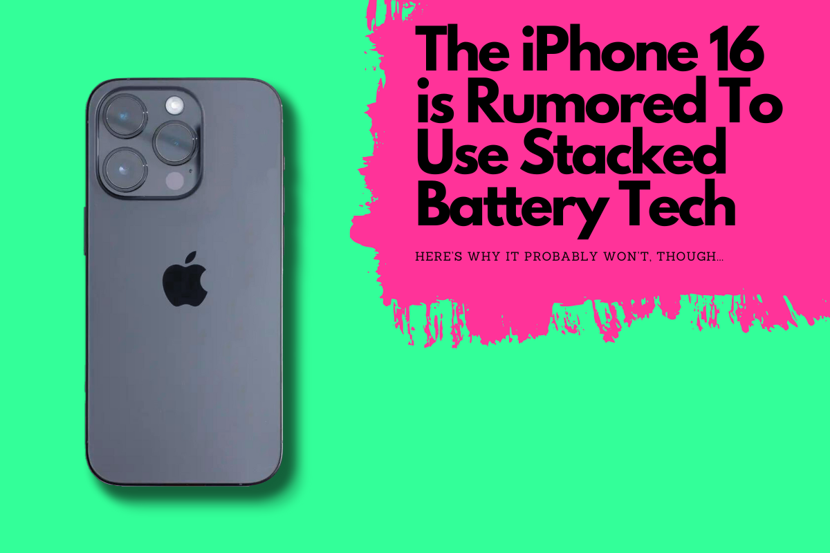
iPhone 16 “Stacked Battery” Rumor is BUNK – Here’s…
Imagine having the same sized phone, but with a significantly bigger battery. That’s how stacked batteries work – and they could be coming to ...

EU Cracks Down: iPhone Faces Big Changes Under…
Apple’s traditional “walled-garden” approach to iPhone is slowly being pulled apart by EU regulation – and this is a good thing First the ...
Apple Reveals It’s Bringing Another Exclusive Feature To…
In addition to alternative app stores, EU users will eventually be able to set default navigation apps. Earlier this week, Apple released an update...

Tensor G4 For Pixel 9 Will Bring “Major”…
The Samsung-built Google Tensor G4 chip looks poised to bring Galaxy S24-like performance to Google’s Pixel 9 series in 2024… Google’...
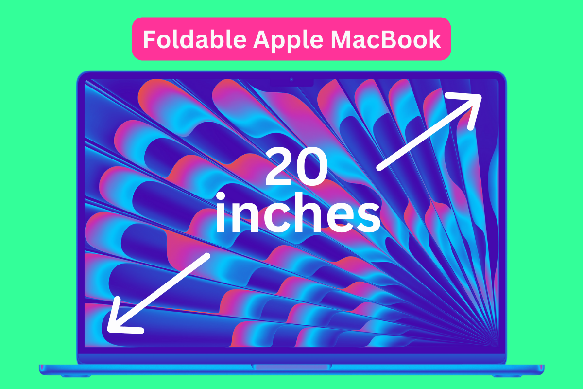
Apple is reportedly working on a 20-inch foldable…
Apple’s first foldable might not be an iPhone or iPad, but a foldable MacBook with a 20-inch screen. Apple may have just released the new M3 MacB...
Nothing Phone (2a) Has A Major Issue You…
The Nothing Phone (2a) is a brilliant little device, bringing some much needed flair to the budget-end of the market. Is it perfect? No. But it is ...
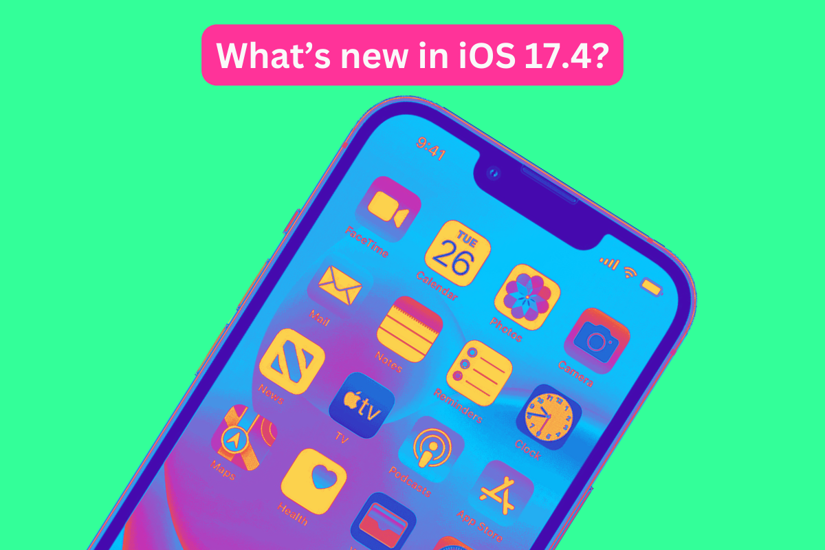
Apple Releases iOS 17.4 for iPhone with Alternative…
The company has released iOS 17.4, which adds several new features including alternative app stores. Apple has released iOS 17.4 for iPhone and wit...
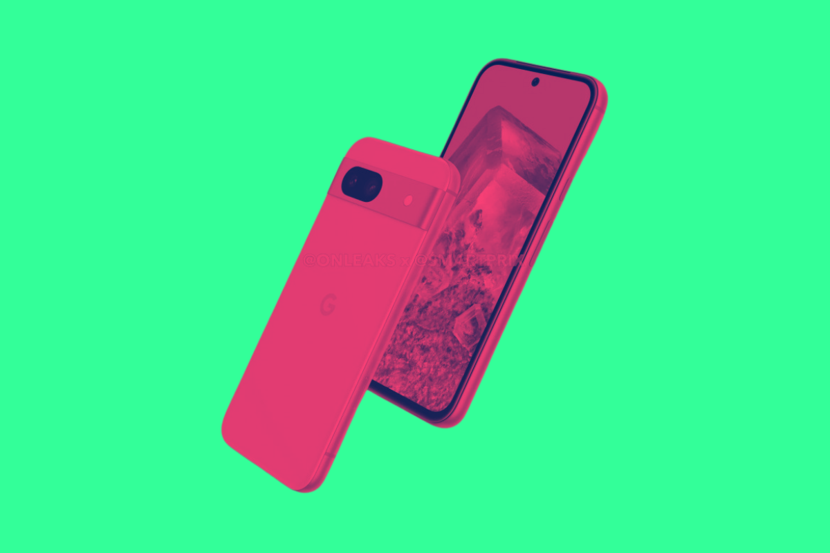
Google’s Pixel 8a Colors: What’s New Color-Wise For…
A new year means a new Pixel phone. But what colors with 2024’s Pixel 8a be available in? Here’s what we know so far… The Pixel 8...

Google’s Pixel 8a Will Cost More – Here’s Why…
The upcoming Google Pixel 8a will cost more than its predecessor, the Pixel 7a – here’s why that’s the case… Google’s Pixel A-series pho...
Apple’s A18 CPU: What To Expect Performance-Wise
With a mooted performance uplift of 20%, Apple’s A18 CPU for the iPhone 16 Pro and iPhone 16 Pro Max continues to deliver the goods It’s not of...

Only These Pixel Phones Will Get 10-Bit HDR…
Google’s Pixel phones have long been known for their imaging and video prowess. But the latest Pixel Update – the March 2024 one, specifically ...

8 Exciting Updates Inside Google’s March 2024 Pixel…
Google’s March Feature Drop for Pixel devices is here, and it’s packed with updates that Pixel phone, Pixel Watch, and other Pixel devi...
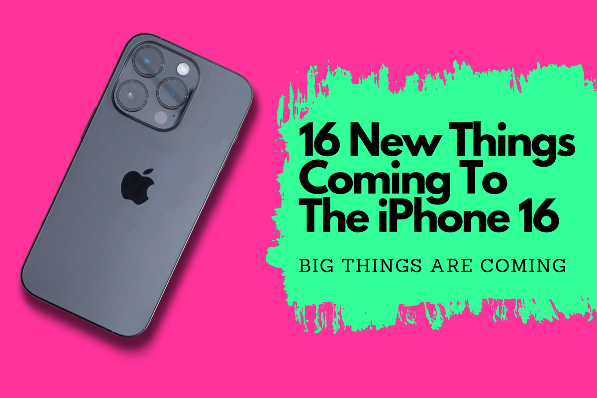
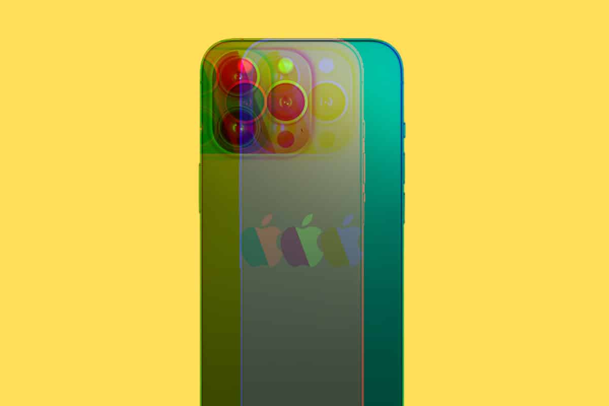
16 Things You Need To Know About The…
The iPhone 16 series is coming in 2024 and unlike last year’s there’s quite a few changes on the cards. Here’s 16 of the best one...
The iPhone 16 Will Use WiFi 7 – Here’s…
Apple’s incoming iPhone 16 series probably won’t look any different from the iPhone 15 series. But at least it’ll have WiFi 7… Apple’s la...
Android 15: What You Need To Know – The…
The first developer preview of Android 15 is here and it is all about performance, security, AI, and closer ties with Samsung Google’s next...

M3 MacBook Air: Specs, Price, Release Date &…
Apple has unveiled its new line of M3 MacBook Airs in both 13-inch and 15-inch models. Here’s what you need to know! Apple surprised everyone tod...
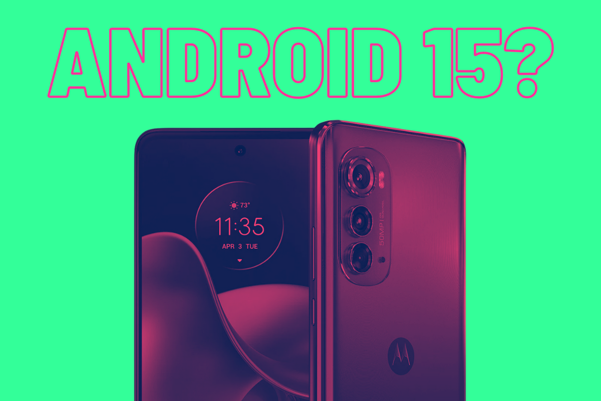
Will The Motorola Edge 2022 Get Android 14…
Motorola’s Android support leaves quite a lot to be desired. But will the Motorola Edge 2022 get Android 14 and even Android 15?
...